
Brand-guided AI infographics should help a reader understand your article. Before I generate one, I ask what the graphic needs to explain, which approved passage it represents, and what an editor must check before it can be published.
I built this approach into Content Updater, which suggests suitable sections, combines their copy with a saved visual brand profile, and keeps generated infographics pending human approval. During development, I generated and reviewed an eight-stage workflow infographic and a blue-and-green cover. Those examples are practical tests of my workflow, not a benchmark of image-model accuracy.
This guide shows how to choose an appropriate visual, prepare a reusable prompt, maintain the connection with source text, and review the result. I also cover text alternatives and image SEO using W3C and Google guidance. The aim is a graphic that earns its place in the article, with enough surrounding explanation for readers who cannot use the image.
Key takeaways
- Anchor visual generation directly to approved article copy and requested brand palettes rather than open-ended descriptive prompts.
- Deploy evidence-carrying infographics for complex operational sequences, while reserving semantic HTML tables for comparisons and data-driven tools for quantitative charts.
- Implement an editorial lifecycle that flags visual assets as stale whenever source section copy, prompts, or brand profiles change.
- Inspect every generated diagram manually for exact spelling, connector logic, mobile scaling, and labels that do not rely on colour alone.
- Use a short identification and a long text equivalent for complex images; figure and figcaption provide one possible structure (W3C WAI).
When to use AI article visuals instead of text
You should create AI article visuals only when a spatial layout, chronological sequence, or relational structure explains a concept more clearly than paragraphs of text. Adding generated images purely for decoration dilutes technical substance and increases maintenance work for your editorial team.
To decide whether an image is appropriate, distinguish decorative cover art from evidence-carrying infographics. A decorative cover illustration sets an aesthetic tone, similar to the blue-and-green article cover I generated and reviewed during the development of Content Updater. Label cover art as illustration and avoid presenting it as documentary evidence. In contrast, an evidence-carrying infographic portrays operational steps, system architectures, or workflow dependencies. Every box, arrow, and label in an evidence-carrying graphic constitutes an editorial claim that must reflect your researched draft.
Before prompting an image tool, evaluate which format serves the reader best:
- Process diagrams: Choose a visual diagram when a workflow involves multiple handoffs, parallel tracks, or sequential milestones. Use the diagram to make the handoffs visible, and keep the full explanation in the text.
- Comparison tables: Present multi-attribute comparisons in semantic HTML tables rather than generated images. I prefer an HTML table because I can edit and copy its text directly. Check its headers, reading order and mobile layout before publication.
- Quantitative data charts: Use dedicated charting software, code libraries, or spreadsheet exports for numerical datasets. When your article cites percentages or metrics, plot them with data-driven charting tools.
- Body prose: Keep nuanced conditional arguments, policy requirements, and subtle conceptual distinctions in standard text. Forcing complex conditional logic into a flowchart clutters the visual canvas and obscures meaning.
Structuring visual prompts from approved editorial copy
You structure visual prompts by feeding locked text from approved editorial drafts directly into your instructions, pairing that copy with layout constraints and codified brand colours. Generating visual assets from loose summaries invites creative deviation, leading to invented steps or decorative elements absent from your writing.
In Content Updater, I configured prompt templates that combine verified section copy with a saved brand profile. For my test setup, the brand palette specified four requested hex values: primary #155EEF, secondary #087F5B, background #FFFFFF, and text #172B4D. I treat these hex values as requested targets rather than fixed code assignments. I check the rendered colours against that palette and inspect every label. I keep stage titles short and leave detailed explanations in the surrounding prose.
The following illustrative prompt example demonstrates how to build an image request from an approved five-stage asset lifecycle:
Role: Technical editorial diagram. Create a clean vector-style process diagram on a solid background.

Source content to illustrate:
1. Section selection: The editor identifies an approved article section explaining an operational sequence.
2. Generation: The system compiles locked copy and requested brand colours into a visual prompt.
3. Human inspection: The editor reviews the generated image for factual alignment, spelling, and contrast.
4. Editorial sign-off: The visual is approved and embedded into the article draft.
5. Invalidation tracking: The asset is flagged as stale if source copy, prompt text, or brand settings change.

Layout instructions: Arrange the five stages horizontally from left to right with directional arrows connecting them. Leave generous whitespace around each node. Do not add extra stages, decorative characters, or unlisted metrics.

Requested colour palette: Primary elements in #155EEF, secondary accents in #087F5B, background in #FFFFFF, text labels in #172B4D.

Typography: Render legible sans-serif labels matching the exact stage names above. Keep labels short and readable.
When writing prompt instructions, specify clear spatial relationships such as horizontal progression, clean margins, and distinct separation between containers. Restricting the graphic to short node titles simplifies visual composition and reduces the risk of unreadable text. If a rendered image contains an illegible label or a misplaced shape, you can adjust the prompt wording or correct the asset during your quality assurance review.
Managing brand-guided AI infographics across content updates
You manage brand-guided AI infographics across content updates by tethering every graphic to the exact text section it illustrates. When software interfaces update, operational steps change, or brand guidelines evolve, disconnected graphics quickly become obsolete and present conflicting instructions.
I addressed this problem in Content Updater by establishing a direct link between visual assets and their underlying editorial records. The application saves the source section text, the compiled prompt, and the brand profile used for each image. If an editor edits the section copy, adjusts the prompt, or changes the brand profile, Content Updater marks the infographic as stale. This stale flag is an internal notification indicating that source inputs changed and the graphic requires review. It does not check live web pages or provide independent factual validation.
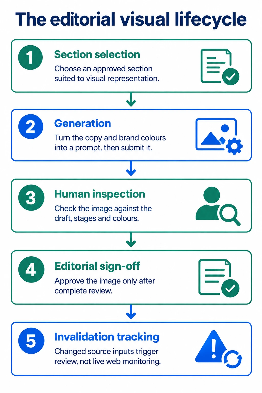
A structured visual management process follows five distinct stages:
- Section selection: You identify an approved section of article text that describes a multi-step sequence or structural relationship suited to visual representation.
- Generation: You combine the approved copy and requested brand colour values into a structured prompt, then submit it to the image model.
- Human inspection: You review the resulting image against the source draft, checking that stage names, directional arrows, and colours reflect your editorial intent.
- Editorial sign-off: You approve the image for publication only after complete review, keeping unverified assets out of live articles.
- Invalidation tracking: If future edits change the source paragraph, the prompt, or the brand colours, the system marks the graphic as stale so you can decide whether to update or retire it.
Connecting this asset lifecycle to your broader AI content automation workflow allows you to track visual maintenance systematically as your technical articles expand over time.
A visual QA checklist for AI diagrams and charts
You inspect AI diagrams and charts through a structured quality assurance review that examines spelling, visual hierarchy, colour contrast, and directional logic. My review looks for incorrect characters, missing stages and reversed connectors, even when the overall composition looks appealing.
In my own publishing process, I treat visual quality assurance as a mandatory editorial safeguard, applying the same diligence I use when source checking AI drafts in written text. Before adding any graphic to a publication draft, work through these specific checkpoints:
- Text labels and spelling: Read every rendered word character by character. Check technical vocabulary, missing letters and spacing between words. Every label must match the approved wording in your source copy.
- Connector arrows and sequence: Follow each arrow or connector line from its origin to its conclusion. Confirm that directional indicators match the real workflow. A reversed arrow or an erroneous branch completely changes the operational meaning of a process.
- Visual hierarchy and contrast: Check that primary stages stand out visually before secondary annotations. Verify that text in charcoal #172B4D against the white #FFFFFF background maintains strong contrast for readability. Do not rely solely on colour to convey procedural state; use numbered sequence markers or explicit text labels so readers with colour vision variations can follow the steps.
- Numerical data: If a diagram displays quantitative metrics, verify each number against primary source documentation. For all quantitative charts, use data-driven charting tools rather than generative image models.
- Responsive scaling: Review the visual at standard mobile screen widths. Verify that label typography remains readable and that borders or text are not cropped awkwardly.
When an asset has a strong composition but contains defective raster text, decide on a remediation path. You can open the image in a graphic editor, remove the flawed raster text, and replace it with clean vector type. If manual retouching takes too long or leaves artefacts, regenerate the image with simpler text constraints or present the sequence in clean HTML.
Accessibility standards and image SEO for complex visuals
You make complex visuals accessible and discoverable by pairing every graphic with descriptive alternative text, semantic HTML markup, and detailed textual equivalents in the surrounding article. Visual assets that convey multi-step procedures require accessible text descriptions so that all readers, including those using screen readers, can interpret the information.
For complex images carrying substantial information, W3C WAI recommends a two-part text alternative consisting of a short identification and a longer text equivalent (W3C WAI). The short identification identifies the graphic, while the long description provides the full information shown in the visual. W3C WAI gives an example using the HTML5 figure and figcaption elements to associate a complex image with a long description that can include headings, text, and a table (W3C WAI).
The following illustrative HTML shows one way to provide this two-part description. Notice how the image and its comprehensive description sit together within the figure container:
<figure>
  <img src="editorial-visual-lifecycle.png" alt="Five-stage process diagram for managing brand-guided AI infographics.">
  <figcaption>
    <h3>Editorial visual lifecycle breakdown</h3>
    <p>The diagram outlines five sequential stages:</p>
    <ol>
      <li><strong>Section selection:</strong> Identifying an approved section explaining a sequence.</li>
      <li><strong>Generation:</strong> Compiling copy and brand colours into an image prompt.</li>
      <li><strong>Human inspection:</strong> Checking rendered images for spelling and contrast.</li>
      <li><strong>Editorial sign-off:</strong> Approving the graphic before publication.</li>
      <li><strong>Invalidation tracking:</strong> Flagging assets as stale when inputs change.</li>
    </ol>
  </figcaption>
</figure>
Alongside accessibility markup, align your image publication practices with guidance from search documentation. Google Search Central recommends short, descriptive image filenames, noting that filenames give only light clues about image subject matter (Google Search Central). Instead of uploading a default camera or generator filename, assign a clear name such as editorial-visual-lifecycle.png.
Google Search Central also recommends informative, context-appropriate alt text while avoiding keyword stuffing (Google Search Central). Write concise alt text that conveys the purpose of the visual within its specific section. In addition, Google Search Central recommends placing images near relevant text, explaining that page content, captions, and image titles help it interpret image subject matter (Google Search Central).
These technical practices support visitors using assistive technology and make your content structure clear to search systems. Adhering to these conventions improves document usability, though it provides no guarantees regarding search engine rankings.
As a practical next action, choose one published article that currently relies on an uninspected image. Review its labels against your original source text, verify that its colour contrast is readable, and wrap the image in a semantic figure element with a structured text equivalent.